Year: 2023
To re-brand an existing product, an alcoholic beverage called "Santiago de Cuba." I prioritize making the new brand aesthetically more appealing, boasting its sales and becoming a vital competitor with similar rums from the Island. The first challenge I encountered was that, unfortunately, the product was unavailable in Canada; this brought the difficulty of experiencing how it stands on the shelves. I used other Caribbean rums, such as Plantation ( Jamaican), as inspiration and competitors to work on my design.
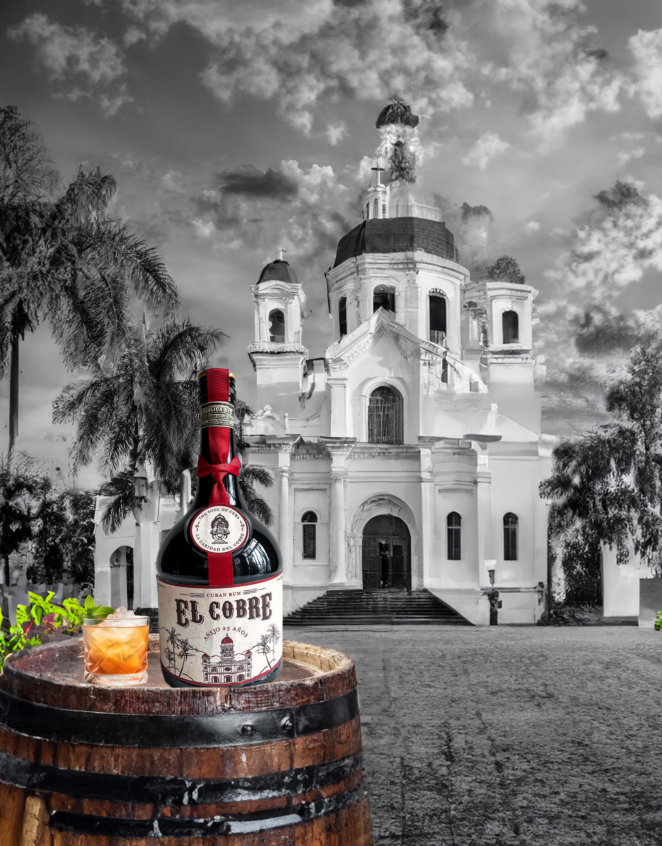
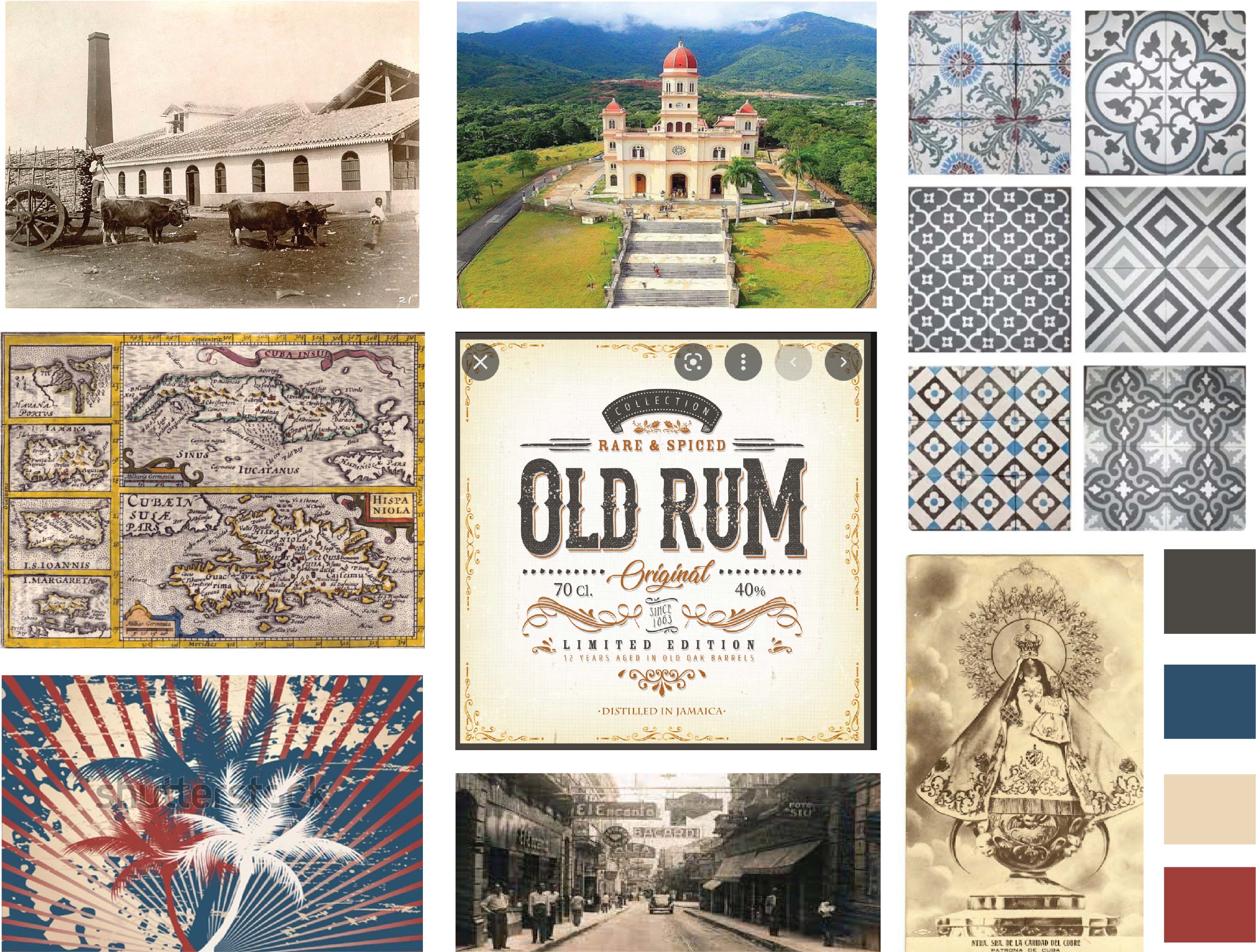
To change the logo and design entirely. Currently, the logo design elements are the tropical and geographical characteristics of the region. I wanted to bring back the history and heritage that the brand deserves. El Cobre is a well-known church in the middle of a conglomeration of mountains called Sierra Maestra. From the seventeen century, believers and non-believers visited and worshiped a black Madonna for protection. It is popularly known as the soul of Cuba. My approach is to bring those elements into the design.
I wanted to give the brand a vintage look and feel. Cuba feels like it is from another era; with its peculiar colonial architecture and iconic 1950s cars, the island sits like travelling in time. This vintage component can make the brand look authentic. Older-looking fonts, images and colours can drive consumers to nostalgia, to a past that brings joyful memories. Instead of focusing on ingredients and flavours, I would like to focus on the history and heritage that the new brand communicates.
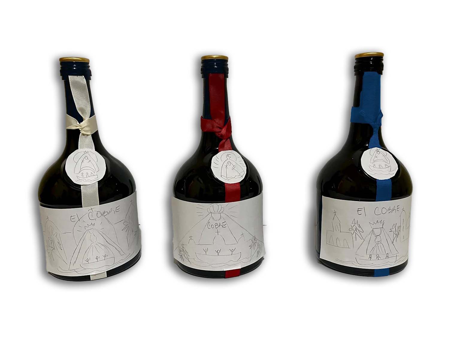
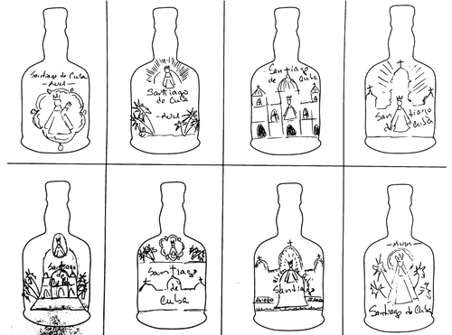
I started experimenting with some thumbnail sketches. These ideas translate the religious aspect of the brand. The idea of the Virgen de la Caridad ( Virgen of Charity) as the central figure for the logo came up a few times. The outline of the church, or the church itself, could be used as the main illustration adorned by the typical vegetation of the region

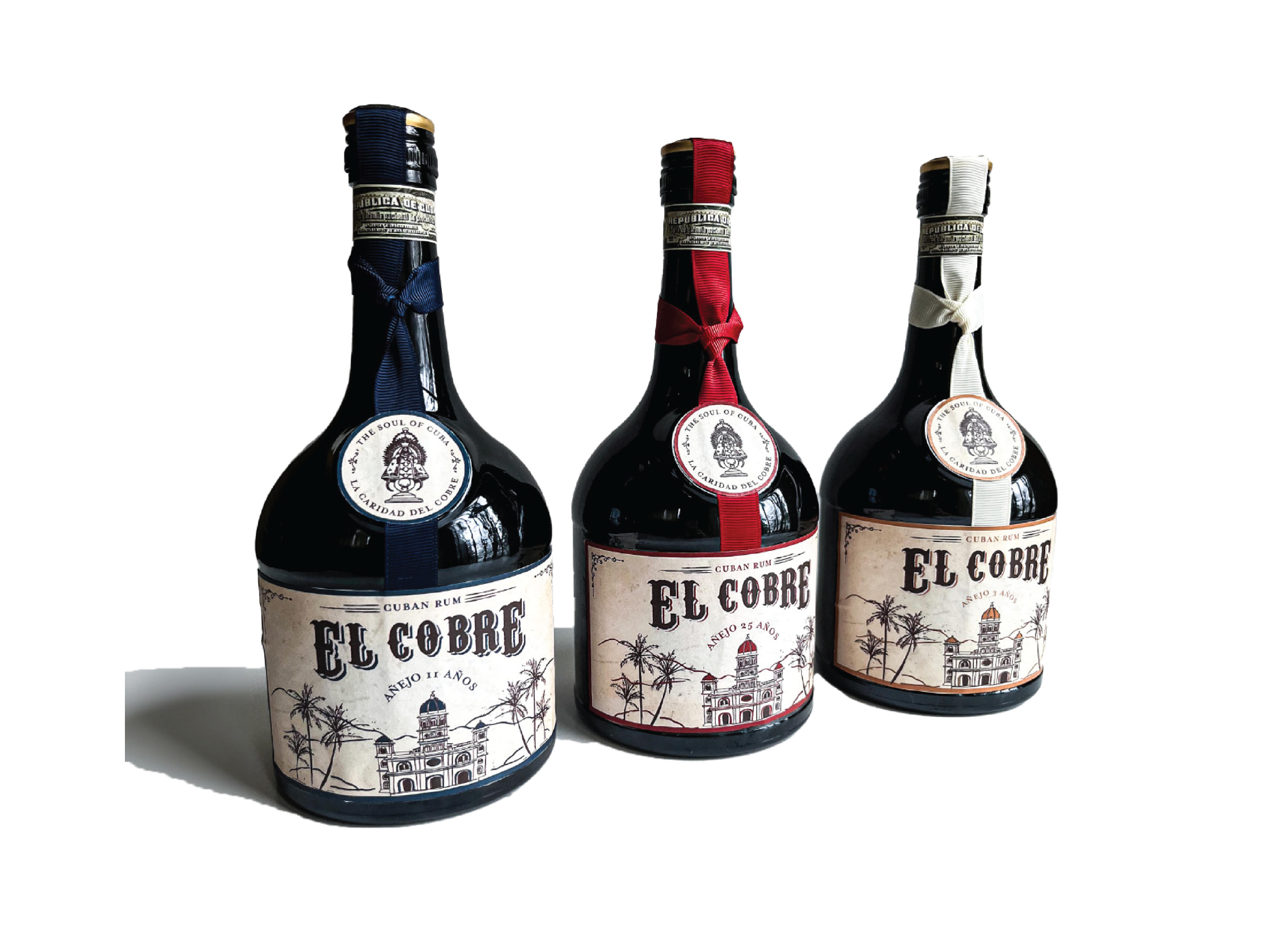
After visiting some stores, I finally decided on this vessel. Luckily enough, these bottles didn't have an embossment. I had some ribbon at home and played a bit with it. I remember seeing a few bottles with stripes that stood out from the shelve. Red, off-white and blue are the primary colours I decided to use for my design. While looking for inspiration, I did an image search through the vintage Cuba posters, and those colours stood out the most. Besides, It has patriotic symbolism as those are the colours of the Cuban flag.
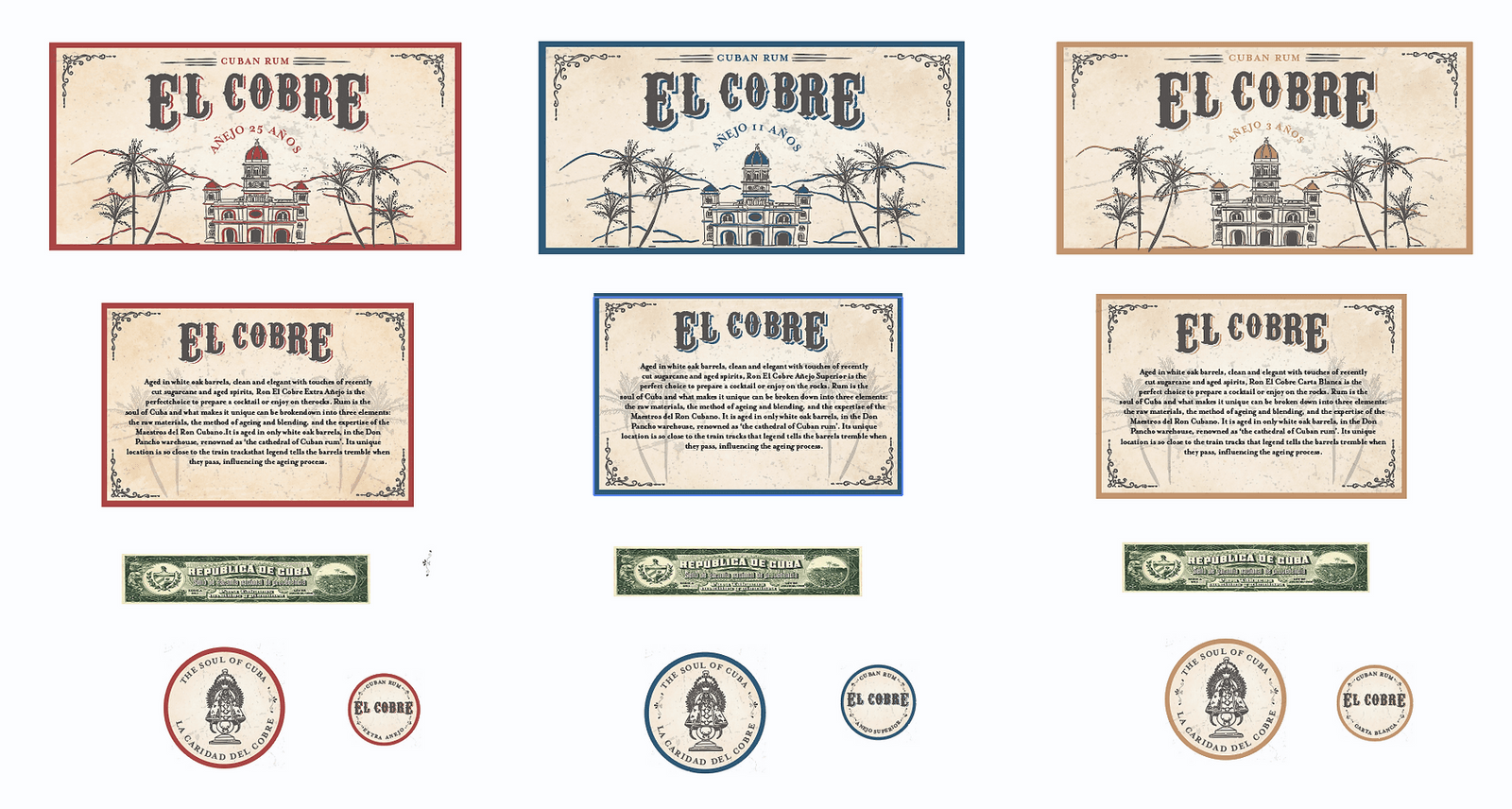
After finding an old stained vintage paper for the background, I used photography as guidance, and with an ink pen in Procreate, I drew the church, palm trees, mountains and the logo. After exporting it as a jpg, I vectorized it in illustrator and manipulated the drawings to my liking. Finally, an overlay grunge texture gives the design a more rough and vintage look. After sketching and experimenting, I changed the name entirely to "El Cobre", the church's name. And in the logo included "La Caridad de Cobre" -The soul of Cuba- as she is the protagonist.
